 It's finished! (And so are Quarter 2...and Semester 1...whoa) I did eventually come up with a name for it - it's called Rising Storm. I named it for the "storm" that "rises" whenever a survivor of sexual assault comes forward, as well as the survivor's "rise" against sexual assault and the "storm" of emotions they feel. (It also fits the wild and somewhat confusing nature of the negative space and the many moving hands of the survivor.)
I hope to continue this general feminist theme, but whether I stick with sexual assault or not I still have to decide. The fact that I have never been sexually assaulted will likely factor into my decision. I do have another idea for a piece, but it deals with basically the exact same theme. It would involve a character from one of the stories I've (partly) written, telling her story. I would incorporate color this time; there would definitely be a lot of red, since that's what she wore most of the time before she was assaulted. On the other hand, I may choose to go with a new theme under the umbrella of "angry art" and "female art," although I'll have to think about what that would be.
0 Comments
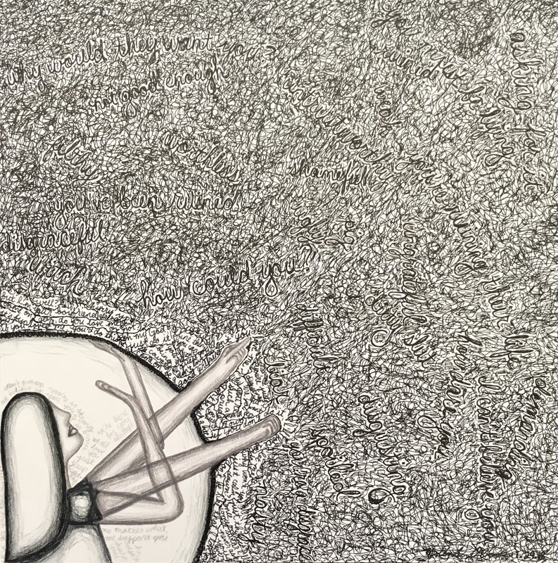
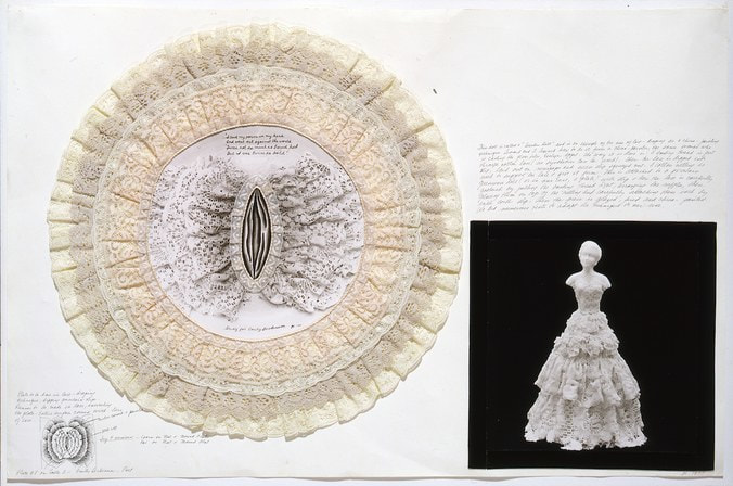
My newest project represents a continuation of my feminist art theme - my protest art, or "angry art," if you will. Drawing from a conversation I had with a friend, I created an image of a girl both under attack - and protecting herself from said attack - and fighting back. When women and girls (obviously others are affected as well, but this piece and my theme in general is made to focus on the negative aspect of the female experience) fall victim to sexual assault, many do not come forward to protect themselves, because of how pervasive rape culture is in this country and worldwide. If they do choose to come forward, they most often face degrading verbal, sometimes physical, attacks from doubters or rape sympathizers.
The black storm of words surrounding the survivor in the bottom left corner represents the things female victims of sexual assault have either heard or fear they will hear. The larger words represent the general public, while the smaller and closer-to-the-girl words come from the assaulter. The girl has burst through her own shield (which says "NO" over and over around the border; her attempted defense) with two of the hands, the ones that are fighting back and getting straight to the point. The other two hands are up to protect herself from the attacks, as the "NO" shield often fails to work. While the background is (well, will be) fully black, the negative space around the girl is white, to represent her purity as she is not the one at fault. The words around her are lighter, as they are not only less hurtful but positive, and they come from her supporters who remind her that she is strong, she is brave, she is a fighter. The girl herself is done in shades of gray, as accusers in general expect that she is a morally ambiguous or impure person, but the color scheme is black and white - in the end, sexual assault is black and white. You either assaulted someone or you didn't; there is no in between. I originally had a title, but it may change to be more general once I finish up the piece today. I get it critiqued tomorrow, but I only have to finish up the main storm of words and mat it before then. I hope I can come up with a title soon; I don't want all of my art to be called "Untitled." It's finished! (Actually, it was finished a long time ago, but right now it's officially on display.) This piece marks the beginning of my departure from my previous wedding theme. At first, my wedding theme seemed like a natural continuation of my Head & Heart series. However, one of my favorite art projects I've ever made at MLWGS was my mixed-media social justice "painting," and I loved it so much because it gave me a way to protest against an issue personal to me. As Quarter 1 went on, I began to feel very trapped by the wedding theme, since I felt that it was only portraying a rose-colored view of the world, and I made this piece as a bridge between the wedding theme (the piece is of a young woman trapped by societal bridal expectations and attacked by words that young girls hear from birth about how they should behave/what kind of bride they must be) and the upcoming feminist theme.
Although I have not been on any end of these phrases (except the receiving end of some of the more minor ones), I know other people who have had these things said to them, and the point of my art is rapidly becoming relatability among women. (In this matter I will have to be careful to not leave too many people out - hopefully my feminism will be improved in making this new art.) I feel like I have finally moved in the direction I wanted to be in all along - expect more pieces even further in this direction coming soon! In December, we took our annual art department trip to Washington, D.C. We saw three galleries: the National Gallery, the Hirshhorn, and (a first for me!) the American Art Museum and Portrait Gallery. At the National Gallery, I saw a great deal of work, the vast majority of which was abstract, and while I sadly did not have the chance to see the Vermeer exhibit, I did pay a visit to the giant blue rooster on the roof of the gallery. (This rooster may very well be my favorite thing at the National Gallery.) At the Hirshhorn (my favorite of the two previously experienced galleries this year), I got to see the Ai Weiwei exhibit, as well as a few others (I can't recall the artists' names that made them right now). The final stop of the day was the American Art Museum, and since I had never seen it before, it was an even greater experience than it might have been otherwise. I was blown away by the fantastic art; everything there felt new and exciting while also maintaining a sense of proud American tradition.
I managed to find a piece for our assignment from each gallery. Though the Hirshhorn was my favorite (before heading over to the American Art Museum), I was still fascinated by a room in the National Gallery featuring an artist (Saul Steinberg) whose markmaking style seemed very similar to my own. His pieces felt very familiar to me as a result, almost as if I could have made them myself. However, his content was very different, featuring war instead of women, and to that end I ask: why did he choose to make these pieces in this simplistic style? My piece chosen from the Hirshhorn was an enchanting display of photographs of young children's faces, placed among lightbulbs and boxes and left smiling out at audiences worlds younger than them. I was deeply interested in the children - although photography is not the direction I want to pursue, I appreciate how it tells each child's individual story and yet raises more questions: what were the children doing at the time? What was the historical context of each picture? Why were some children smiling in their pictures and others not? At the American Art Museum, I chose a piece done about (and including snippets of) the Eighth Amendment to the U.S. Constitution, in clever painting form. At first glance, the painting was abstract and nonobjective. However, as I approached it, I noticed words peeking out from behind the pink and yellow splatters of paint. I still cannot remember the exact words in the painting, or the words of the Eighth Amendment for that matter, but I was reminded of my own, new tendency to place (and often hide) words in my art. It inspired me to keep doing just that, and my newest project (process post coming soon) will incorporate this idea.
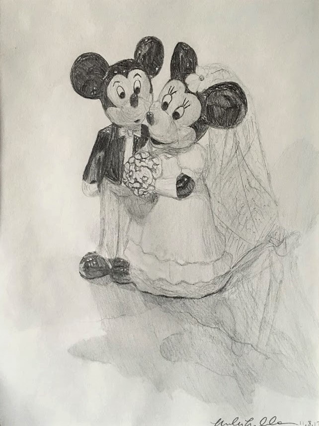 "Process" is a word to be used lightly here, since this is the only photo I have of this piece, finished or otherwise. As the photo indicates, the piece is finished, and was taken down from its spot in the hallway just a little while ago. (That spot now belongs to my next piece, which is sadly still untitled - look out for that post.) I made this piece because I had run out of ideas, and the subject for this piece was conveniently available. It was drawn in pencil, in the style I use to draw still lifes, as this was a return to my old insistence of lack of abstraction. The piece depicts my parents' wedding cake topper, received when my dad proposed to my mom in Disney World and an employee happened to be walking by; soon after, they got a gift basket from the resort, the cake topper among the spoils. This piece is aptly titled Est. 1996, after the year of their wedding. A gallery picture will be coming soon.
On this walking field trip, we visited 3 different galleries. The first had floral-inspired work in everything from sculptural installations to colored-pencil panels, as well as a separate, abstract, nonobjective exhibit. The second had oil paintings of city scenes, in a style that blurred parts of the painting and made others clear (as if depicting a rainy day). The third had a portrait exhibit featuring black people in their everyday lives - not photographed, as I originally thought, but drawn in pencil.
The floral exhibition was very fascinating to me due to its attention to detail. As shown in the second picture, the artist's style involves filling every possible inch of space with some small detail, and I like that idea and hope to use it in my own artwork sometime. The nonobjective exhibition in the same gallery drew me in less but still held my attention - my favorite piece is the row of boxes on the wall. Although my style of art is very different from some of the more abstract pieces, I thoroughly enjoyed making my AbEx painting last year and since then have wanted to make another...perhaps on my own time, since it does not fit with my theme or artist statement (currently in the works) I absolutely loved the second exhibition, with its distinctive style and masterful mark. I loved how some parts were blurry and some were clear, creating an image that still looked very real. I am definitely curious about how this artist developed their specific style, since it both seems to fit and deviate from the artistic norm of realism. However, I don't think I will ever make art like this, since I have no interest in city art (I have no interest in cities or living in them, so the idea of depicting them in art is unappealing to me) and the oil painting project last year, while a useful experience, proved that I have little to no patience with oil paint. The third show, the portraiture show, particularly caught my attention because, upon first glance, I thought the drawings were photographs. Upon realizing that they were, in fact, drawings, I became very amazed and couldn't resist taking pictures of every single portrait in the space. Until very recently, I wanted to draw people photorealistically for my art; I wanted to improve my mark to the point where this artist makes his art. Once it became clear to me that such a feat would be nearly impossible in the short time frame I have for each piece, however, I became more focused on developing my own specific style and deviating from the realism I once idolized above all other artistic styles. That being said, I am immensely impressed with this artist's pieces, and I like that they give representation to a group of people not typically found in museums and galleries. I apologize for the lack of posts! More posts coming soon! Look out for 2 experience posts, an awareness post, and project updates (as well as gallery updates too)
For the second quarter, we read two articles discussing art shows - one called "The Disasters of War, 1800-2014" in a French museum (art. 1, p. 2), and one showcasing art made during and as a result of World War I. Both shows (and articles) focused on the way artists reacted to the wars of their era. However, it was done in much the same way as each other, with both describing examples of art and art shows that deal with responses to war or other related suffering. Though one was more comprehensive than the other (focusing on art from 1800 to 2014, versus the much smaller span of time of World War I), and the more comprehensive article offered a few paragraphs of personal experience from its author, the stories were told the same way for slightly different views.
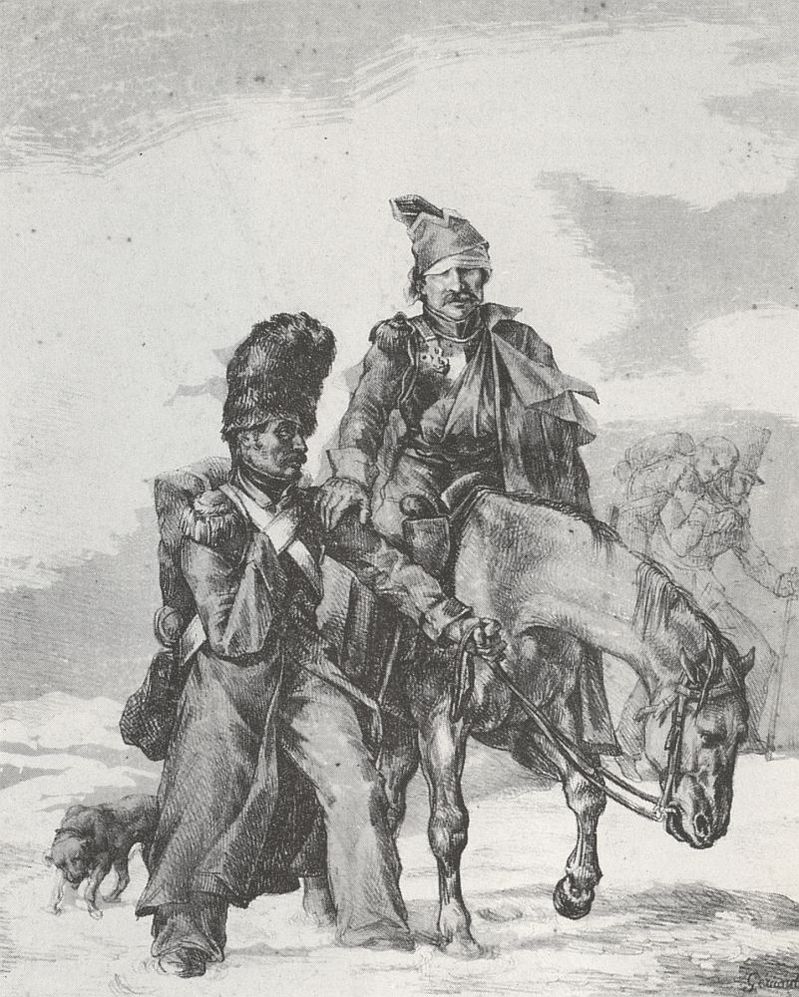
I did not find anything really surprising in either article - I had correctly assumed that the artists in the shows would make such reactionary art, although some of it was more gruesome than I had expected. However, several small pieces in the articles did catch my eye, one of which was the comparison between the Napoleon paintings: "Barely 15 years later, the conception of what was worth depicting had shifted dramatically." (art. 1, p. 3) The first painting was the famous one we know, with Napoleon in his war uniform seated on a rearing white horse in full battle regalia. The second painting is the one featured at left, titled "Return from Russia" (named for the period after Napoleon's failed attempt at conquering Russia). Another comparison I found interesting was in the second article, which discussed art styles of the time at the bottom of the second page. Modernism had been the prevailing art style at that point in European history, but World War I changed everything. The British pulled away from it, as it "was identified with the enemy," and so they "reached (sic) backward to the steady, reassuring hands of tradition." However, the Germans, as they were losing, abandoned modernism as well, since they "are on the losing side and don't want to connect to the past. They want to sever ties with all that." (art. 2, p. 2) The readings definitely paralleled the few artists and pieces we did cover in relation to pain and suffering. Käthe Kollwitz even made an appearance in the second article; it discussed the same ideas we talked about in class, albeit in a more summed-up fashion - her son died in World War I, so she became devoted to making antiwar art. However, since Kollwitz was the only artist we covered in our notes (so far), there was not much else to compare the articles to. Hopefully if/when we cover more on this subject, more parallels will make themselves apparent. |
AuthorMolly Goodman Archives
May 2019
Categories |
 RSS Feed
